Is your top performer working 60-hour weeks while another team member has idle capacity?
Many organizations face this challenge daily, struggling to distribute workloads fairly and prevent burnout. The Power BI resource utilization dashboards provide a dynamic solution, transforming scattered spreadsheets into a real-time capacity dashboard with interactive insights.
By the end of this guide, you’ll understand how to implement dashboards that support project team capacity planning, reveal team capacity instantly, help balance workloads, and prevent burnout, while gaining actionable visibility into resource allocation and performance.
Why Resource Utilization Dashboards Matter (More Than You Think)
Resource managers often lack real-time visibility into team workload distribution and capacity utilization. Spreadsheets and manual tracking can cause delays, but smarter tools bring clarity, helping teams prevent overallocation and burnout early. Power BI dashboards change this by acting as a capacity management dashboard for teams, while also providing summarized insights that HR managers, PMO leaders, and executives can use for strategic planning and oversight.
They consolidate multiple data sources, automate calculations, and present resource utilization metrics visually so anyone can understand them.
Improving visibility can unlock significant value. It can drive burnout, increase turnover, and slow productivity, but addressing it keeps projects on track, strengthens stakeholder confidence, and empowers executives to make smarter, portfolio-level decisions.
Real-time tracking enables proactive capacity management, helping managers rebalance workloads before problems escalate using workload balancing Power BI insights.
Automation saves hours of repetitive reporting, freeing teams to focus on strategic decisions and resource optimization Power BI. A fair workload distribution boosts morale, improves retention, and provides a competitive advantage.
Understanding Resource Utilization: The Basics
Resource utilization shows how effectively a person’s available time is used for work, capacity represents total available working hours, and workload distribution helps build a well-balanced, efficient team by distributing work evenly and improving overall visibility through workload distribution Power BI dashboards.
For example, if Alice is scheduled for 60 hours this week while Bob has 20, it highlights an opportunity to better balance workloads; helping Alice avoid overload while giving Bob more meaningful work and improving overall team efficiency. Understanding utilization and workload distribution is essential for resource managers, HR teams, and executives to make clear, informed decisions that improve balance, efficiency, team performance, and long-term planning. Utilization analysis informs rebalancing efforts, ensuring sustainable workloads and supporting strategic decision-making. Mastering these basics sets the foundation for effective team capacity management.
Data Sources: Where Your Resource and Capacity Data Lives
Creating a robust resource allocation dashboard or resource utilization dashboard requires consolidating data from multiple sources:
- Project management tools: Jira, MS Project (including MS Project integration with Power BI), Azure DevOps, Monday.com
- Time tracking systems: Harvest, Toggl, Jira Time Tracking
- HR systems: Employee availability, planned time off
- Resource management software
- Excel spreadsheets
In practice, Power BI connects these data sources into a single view. This becomes the source of truth for teams. Accurate, refreshed data ensures resource capacity tracking and decisions are based on current capacity and allocation. Integrating disparate systems eliminates manual entry and reduces errors, while automated refresh schedules keep dashboards up to date. This makes it possible to track utilization, identify bottlenecks, and support team burnout prevention in real time.
Building a Power BI Resource Utilization Dashboard: Step-by-Step
Creating a resource planning dashboard or resource utilization dashboard in Power BI involves a structured approach. Basic setups are straightforward, while complex environments benefit from expert guidance. This step-by-step conceptual guide explains the key stages to build dashboards that help monitor capacity, prevent burnout, and support workload management Power BI decision-making.
Step 1 – Define Your Resource Categories and Skill Levels
Before importing any data into Power BI, it’s crucial to organize your resources in a logical and consistent way. This helps establish a strong foundation for accurate reporting and analysis.
Key considerations:
- By skill, role, department, and project: Classifying resources by these dimensions ensures consistency across all projects and makes it easier to allocate work efficiently. For instance, separating “Frontend Developer” and “Backend Developer” enables more precise tracking of specialized skill availability and improves overall resource visibility.
- Consistent coding and classification: Standardizing job titles, team names, and project codes prevents errors in utilization calculations. Inconsistent naming can lead to duplicate entries or missing data when creating dashboards, while consistent naming helps ensure clean, accurate, reliable, and well-structured dashboards that are easy to maintain and trust.
- Why it matters: Proper categorization helps managers quickly identify skill availability, allocation bottlenecks, and supports reporting at both team and portfolio levels.
Example:
If all developers are coded consistently under “Developer,” a project manager can quickly identify that Project A is fully utilized while Project B has available capacity, enabling better workload visibility and balance. Consistent categories ensure clear, accurate, and meaningful insights.
Pro tip: Maintain a central reference sheet that lists all resource roles, skill levels, and departments to ensure consistency, clarity, and highly accurate, well-structured data that supports better decisions. This becomes your master guide for all future Power BI dashboards.
Step 2 – Connect Your Data Sources to Power BI
Once resources are defined, you need to consolidate data from multiple systems to build a reliable resource planning dashboard and get a complete picture of team capacity.
Typical data sources:
- Project management tools: MS Project, Jira, Azure DevOps – track tasks, timelines, and assignments.
- Time tracking systems: Harvest, Toggl, Jira Time Tracking – log actual hours spent on tasks.
- HR platforms: Planned leave, employee capacity, and absence data.
- Resource management software or spreadsheets: Provide reliable historical and backup data to enable meaningful trend analysis and continuous improvement.
Key considerations:
- Power BI can automate connections to most of these sources, handle authentication, and ensure secure access.
- Setting up an automated refresh schedule ensures your dashboard always reflects the latest allocations and availability.
- Consolidating multiple sources eliminates manual errors and creates a single source of truth for decision-making.
Tip: Standardize resource and project names before connecting to Power BI. For example, if one system lists “Alice Johnson – Developer” and another lists “A. Johnson, Dev,” aligning them ensures Power BI accurately consolidates data and delivers reliable utilization metrics.
Step 3 – Create Resource Utilization Calculations
With your data connected, you can define the metrics that matter most. Power BI’s DAX formulas make this straightforward.
Basic calculations:
- Utilization Rate: (Allocated Hours / Available Hours) × 100 – a key metric in any utilization rate dashboard, shows how much of a resource’s capacity is used.
- Capacity Remaining: Available Hours − Allocated Hours – highlights how much free time is available for additional work and better workload planning.
Advanced calculations:
- Burnout risk scoring: Identify team members using clear burnout risk indicators who consistently exceed utilization thresholds over consecutive weeks.
- Skill-based availability: Support skill-based resource allocation by tracking specialized skills, identifying gaps, and enabling better alignment of people to the right work.
Example:
Alice has 45 allocated hours and 40 available hours, resulting in a 112.5% utilization rate that highlights strong demand and the opportunity to rebalance workload. Managers can quickly intervene to redistribute tasks or hire temporary support.
Pro tip: Build reusable DAX measures for utilization, capacity, and risk scoring so all reports stay consistent and can be used across different projects or teams.
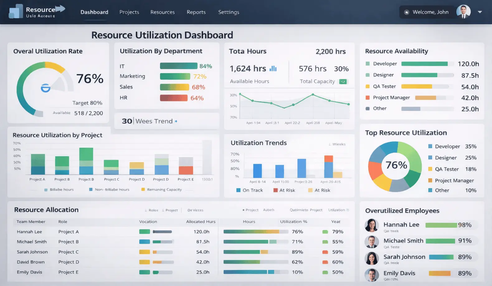
Step 4 – Design Your Visuals for Impact
Well-designed Power BI visuals turn raw data into actionable insights. Avoid clutter and focus on what helps managers make decisions.
Recommended visuals:
- Utilization heatmaps: Quickly spot over- or underutilized team members.
- Capacity vs. demand charts: Identify bottlenecks and overallocation at a glance.
- Workload distribution Power BI scatter plots: Assess fairness and balance across teams.
- Burnout risk gauge charts: Help identify workload imbalances early and support better team balance.
- KPI cards: Summarize critical metrics for executives and stakeholders, such as average utilization, total remaining capacity, and overall team health at a glance.
Interactive features:
- Filters and slicers: View metrics by team, role, project, or time period.
- Drill-through: Dive into detailed allocation data without crowding the main dashboard.
Best practices:
- Prioritize clarity over complexity. Avoid adding every possible metric—focus on actionable insights.
- Use consistent color coding (e.g., light blue for underutilized, dark blue for overallocated) to clearly visualize workload balance and support proactive, data-driven decisions that enhance team performance.
- Annotate key items, such as projects approaching budget limits or resources nearing burnout, to enable timely, proactive action and better outcomes.
Example:
A dashboard shows that the Marketing team is operating at 95% utilization while the IT team is at 70%, presenting an opportunity to better balance workloads across teams. The manager can drill into individual workloads and reassign tasks to balance capacity without waiting for end-of-month reports.
Key Metrics Every Resource Manager Should Track
Managing team resources effectively requires clear visibility into team capacity metrics, workloads, skill availability, and potential burnout risks, along with well-defined project management KPIs that help teams stay balanced and projects remain on track.
Utilization Rate
Percentage of allocated hours vs. available hours (healthy range: 75-85%). Reveals workload intensity and helps enable proactive balance to maintain sustainable performance.
Capacity vs. Demand
Available hours versus allocated hours. Highlights bottlenecks, over- or under-utilization, and helps balance workloads.
Workload Distribution
Shows how evenly work is spread across a team. Balanced distribution supports stronger team morale and improves overall project efficiency.
Burnout Risk Indicators
Tracks overtime, consecutive high-utilization weeks, and time since last vacation to support balanced workloads and overall team well-being. Flags team members at risk and enables early interventions.
Billable vs. Non-Billable Hours
Monitors the ratio of project work to administrative tasks. Critical for profitability and resource optimization.
Skill-Based Capacity
Tracks availability of key skills across projects, preventing bottlenecks and enabling effective resource allocation.
Resource Forecast
Supports capacity forecasting by predicting utilization based on pipeline projects, supporting proactive hiring, training, or resource reallocation.
By monitoring these resource utilization KPIs, managers can make data-driven decisions, prevent burnout, improve team performance metrics, and communicate clear, data-backed insights to stakeholders and executive leadership.
Real-World Example: From Resource Chaos to Balanced Capacity
A mid-sized organization was struggling with team burnout across multiple projects. Resource information was scattered across Excel spreadsheets, Jira, and HR systems, making it difficult to get timely insights. Managers often faced last-minute reallocations, unexpected capacity issues, and leadership surprises, which, when addressed proactively, help reduce stress and support better team stability and retention.
By implementing a Power BI resource utilization dashboard, the organization was able to consolidate data from multiple sources, set up real-time alerts, and clearly visualize utilization metrics across teams. The results were immediate and tangible:
- Balanced workloads across projects
- Faster, data-driven decision-making
- Improved team morale and engagement
- Reduced turnover
- Sustainable project delivery
Working from a single source of truth gave both teams and leadership confidence. Managers could proactively address potential bottlenecks, prevent burnout, and ensure that projects progressed smoothly. This practical approach made resource management predictable, transparent, and much easier to act on.
Advanced Features: Taking Resource Utilization to the Next Level
Power BI dashboards can go beyond basic reporting with features that make resource management more proactive and strategic.
Compared to traditional spreadsheets, the Power BI vs Excel approach offers significant advantages in scalability, automation, and real-time insights. While Excel works well for basic tracking, Power BI enables interactive dashboards, automated data refresh, and centralized reporting, making it more suitable for managing complex resource allocation across multiple projects and teams.
- Automated alerts: Trigger notifications when utilization exceeds defined thresholds, such as 90%, to flag potential overloads.
- Drill-down capability: Explore specific projects or tasks driving overallocation to gain deeper insights and improve workload balance.
- Scenario planning and “what-if” analysis: Forecast capacity and test different resource allocation strategies for better planning.
- Role-based access: Provide tailored views for team leads, resource managers, and executives so each role sees relevant data.
- Integration with project schedules: Correlate resource availability with timelines to understand potential impacts on project delivery.
- Predictive analytics: Leverage historical trends and project pipelines to anticipate future resource needs.
These features are achievable with proper Power BI setup and expertise, turning dashboards into powerful tools for resource optimization Power BI, strategic decision-making, and proactive capacity management across teams and projects.
Common Mistakes to Avoid
Even with the best intentions, many organizations stumble when building resource utilization dashboards. These missteps can undermine your efforts, leading to inaccurate insights, poor adoption, and missed opportunities for resource optimization. Here are the most common pitfalls to watch out for:
- Tracking utilization without context (timeline, project, skill)
- Overcomplicating dashboards with too many metrics
- Not involving stakeholders in dashboard design
- Failing to establish consistent resource codes and categories
- Skipping training on interpreting resource metrics
Addressing these areas helps ensure dashboards remain clear, accurate, and effective for decision-making across teams.
Getting Your Team Aligned: Adoption Tips
Building a resource utilization dashboard is only effective if your team actively uses it. Adoption is strengthened through clear communication, effective training, and active stakeholder involvement. Here’s a step-by-step approach to ensure your dashboards are embraced and deliver real impact:
- Start with critical metrics rather than trying to track everything.
- Involve resource managers, team leads, and project teams early to gather insights and co-create a well-aligned, effective solution.
- Provide training on interpreting utilization metrics and taking informed actions to improve balance and performance.
- Set clear escalation thresholds for overallocated resources to enable timely action and support balanced, sustainable workloads.
- Make dashboards accessible and user-friendly.
- Celebrate early wins to encourage adoption.
- Gather feedback and continuously refine the solution to better meet user needs and improve overall effectiveness.
- Secure executive buy-in: Leadership alignment ensures dashboards are used for real decisions, not just reporting.
- Reinforce real-world behavior: Show how dashboards improve team balance and reduce burnout to drive adoption.
Frequently Asked Questions
What’s the ideal utilization percentage for sustainable team performance metrics?
75-85% is generally considered healthy. Consistently exceeding this shows strong demand and the need for balance.
Can Power BI handle resource data from multiple projects and time tracking systems?
Yes. Power BI can connect and consolidate multiple data sources, providing a unified view of resource allocation.
How do I identify which team members are at burnout risk?
Monitor overtime hours, consecutive high-utilization weeks, and time since last vacation. Dashboards can flag at-risk individuals automatically.
How often should we refresh our resource utilization data in Power BI?
Daily or weekly refreshes are recommended, depending on project pace and team size, to ensure actionable insights.
Can we set up automated alerts when a team member becomes overallocated?
Absolutely. Power BI supports threshold-based alerts that notify managers proactively.
Ready to Balance Your Team’s Workload?
A Power BI resource utilization dashboard gives resource managers, PMO leaders, HR teams, and executives real-time insight into capacity, workload balance, and potential burnout risks, enabling both operational control and strategic decision-making. While basic tracking works for smaller teams, organizations managing multiple projects, distributed staff, or strict capacity limits often need a more tailored approach.
Imagine having complete visibility into your team’s capacity, catching burnout before it happens, and making resource decisions with confidence. That’s what a Power BI resource utilization dashboard delivers. Code Creators specializes in building custom resource dashboards tailored to your specific resource structure and organizational needs. Ready to transform your resource management into a strategic advantage?
These dashboards automate tracking, provide clear visibility into workloads, and support smarter capacity planning. With dashboards like these, teams can stay on top of workloads, reduce stress, and focus on delivering results while enabling better resource efficiency tracking.