Are you tired of Planner’s limited reporting features and the hours spent manually compiling task data into spreadsheets? Managing multiple plans? You can quickly spot overdue tasks, see how workloads are balanced, and keep every project moving smoothly. This often leads to heavy spreadsheet reporting, and it raises the broader question of Power BI vs Excel when it comes to scalable project tracking.
Connecting Microsoft Planner to Power BI transforms static task lists into dynamic, interactive dashboards that improve task visibility, simplify task reporting, and deliver business intelligence insights for better project oversight. This integration enables project managers and team leads to monitor progress, make informed decisions, and communicate results to stakeholders without spending hours on repetitive reporting.
In this guide, you’ll learn step-by-step how to extract your Planner data, connect it to Power BI, transform it into a clean, usable model, and build dashboards that reveal meaningful patterns across projects and teams. By the end, you’ll understand how to turn your task lists into a powerful decision-making tool.
Why Connect Planner to Power BI?
Move Beyond Built-in Reporting
Planner gives you basic charts and summaries, but when you integrate it with Power BI, you can see all your plans at a glance and explore powerful analytics. Integrating with Power BI allows you to track task completion rates, identify overdue items, and visualize team workload trends over time. This also improves workload tracking and enables teams to monitor resource allocation across multiple plans within a single project dashboard.
For example, imagine you manage two overlapping plans, one for product development and one for marketing campaigns. Planner provides a starting point, and with Power BI, you gain full visibility into team workloads across both plans. A Power BI dashboard consolidates this data, enabling you to reassign tasks proactively and prevent bottlenecks before they impact deadlines. If your goal is to build a more structured reporting system, learning how to build Power BI PM dashboard models with proper relationships and KPIs can significantly improve clarity and performance.
Create a Single Source of Truth
Most organizations run multiple plans across different departments. Integrating Planner with Power BI lets you track progress smoothly, avoid inconsistencies, and skip manual data summaries. Power BI centralizes all your Planner data into one unified model. This unified data source ensures data consistency and improves overall operational efficiency when managing multiple projects.
This approach ensures:
- Accurate and consistent task data
- Reliable, shareable reporting for stakeholders
- Visibility into project progress at both team and executive levels
With a single source of truth, you can confidently present metrics to executives or clients, knowing the data is complete and current.
Save Time with Automation
Manual reporting consumes hours each week. Once Planner data flows into Power BI, reports update automatically based on your schedule. Dashboards reflect real-time task progress, freeing teams to focus on strategy rather than repetitive compilation. This time-saving benefit alone can significantly improve team productivity.
Your Step-by-Step Guide to Connect Planner to Power BI
Before You Start: What You’ll Need
Before diving in, make sure you have:
- Power BI Desktop (latest version recommended)
- Access to Microsoft Planner with appropriate permissions for the plans you want to track
- Planner plan URL or plan ID
- Microsoft 365 account credentials
- Understanding of your plan’s structure, buckets, and tasks
- A list of specific plans or task types to include in reporting
These requirements ensure the Planner connector can establish a secure data connection and perform a clean data import into Power BI. Defining objectives beforehand—such as tracking task completion, monitoring workload, or analyzing overdue items will make your dashboard setup smoother and more focused.
Step 1: Locating and Extracting Your Planner Data
Microsoft 365 Groups store and structure Planner data, and it includes essential fields such as task titles, buckets, assigned users, start and due dates, completion percentages, and metadata. In many Microsoft 365 environments, this structure also connects with SharePoint integration, which supports file storage, attachments, and collaboration features linked to Planner tasks. Pull the right Planner data and keep it well-organized—this ensures your dashboard delivers accurate, useful insights every time.
There are two main ways to extract Planner data:
- OData Feed – This method provides a ready-to-use feed containing tasks, assignments, and basic metadata. It’s ideal for small-to-medium teams or when you need a standard dashboard. The feed includes fields like TaskId, Title, StartDate, DueDate, PercentComplete, AssignedTo, and BucketId.
- Microsoft Graph API – This approach offers greater flexibility and control. Graph API allows access to more detailed task information, including custom fields, checklists, progress notes, and complex hierarchies. For larger organizations, or when multiple plans need to be consolidated, Graph API is often the preferred choice.
Practical Example: Suppose you are tracking a marketing campaign plan. The OData feed will give you tasks like “Social Media Post Draft” or “Email Campaign Review,” along with assigned users and deadlines. Using Graph API, you can also pull custom fields such as “Priority Level” or “Estimated Hours,” which allows richer analysis in Power BI.
Common Pitfalls to Avoid
- Nested Assignments: Planner stores multiple assignees as nested objects. If not expanded, dashboards will not reflect the correct workload per user.
- Missing Tasks: Ensure your account has the necessary permissions; otherwise, certain tasks or plans might not appear in the feed.
- Large Plans: By importing plans in stages, you ensure optimal performance and a seamless reporting experience.
Pro Tip: Start by extracting one plan, validate the fields, and ensure task assignments and statuses match Planner before importing multiple plans. This minimizes troubleshooting later.
Step 2: Connecting to Power BI and Authenticating
To connect Planner to Power BI Desktop:
- Open Power BI Desktop and select Get Data.
- Choose OData Feed (or Web for Graph API).
- Paste the Planner OData URL or API endpoint.
- Authenticate using your Microsoft 365 account.
During this stage, configure the connector and select fields carefully so you include only relevant Planner data during the data import, improving overall dashboard performance and usability. When selecting tables to import, only include fields relevant to your reporting goals. Focus on the fields that matter; like task titles, statuses, assignees, and due dates. For instance, leaving out comment histories or checklist items lets your dashboard stay fast, responsive, and easy to use.
Scenario Example: If you want to monitor overdue tasks and team workload, focus on fields like task title, assigned user, start and due dates, status, and completion percentage. These fields provide a strong foundation for KPIs without adding performance overhead.
Step 3: Transforming Your Data in Power Query
Power Query is the tool that turns raw Planner data into a clean, report-ready dataset. A well-structured dataset at this stage directly impacts how effective your Power BI visuals will be, since poorly modeled data often leads to confusing or limited reporting options. The main tasks include cleaning, expanding nested fields, renaming columns, and creating calculated fields. Effective data cleaning and data mapping at this stage help prepare the dataset for accurate reporting and prevent inconsistencies in downstream dashboards.
Expanding Nested Fields
Planner often stores assignments, buckets, and labels as nested objects. For example, a task may have multiple assignees, each with their own completion status. Expand these columns to have one row per assignment or category to accurately visualize workload and task progress.
Renaming and Standardizing Columns
Rename fields to make them intuitive. For instance:
- percentComplete → “Completion %”
- assignedToUserId → “Assignee Name”
Creating Calculated Fields
- Overdue Tasks: [DueDate] < TODAY() AND [Completion %] < 100
- Task Duration: DATEDIFF([StartDate], [DueDate], DAY)
- Workload per User: Count tasks per assignee to monitor team allocation
Handling Task Categories and Statuses
Planner allows free-text entries for categories and statuses. Without standardization, dashboards will show fragmented or inconsistent data. Use Power Query transformations to unify categories, such as “High Priority,” “Medium Priority,” and “Low Priority.”
Practical Scenario: If your plan has tasks labeled inconsistently like “Urgent” and “High,” combine them into a single “High Priority” category. This ensures dashboards accurately reflect priority-based workload distribution.
Optimization Tip: Remove unused columns and filter historical tasks if they’re no longer relevant. This keeps the data model responsive and improves dashboard performance, especially when dealing with multiple plans.

Common Challenges You Might Face (and How to Solve Them)
Understanding Planner’s Data Structure
Planner tasks are more than just simple rows; they include nested metadata, assignments, and references to buckets and labels. Understanding this structure is critical for building accurate dashboards.
Nested Data
Each task can have:
- Multiple assignees
- Labels or categories
- Checklists and comments
Why This Matters: Expanding nested data properly ensures your dashboards accurately reflect all assignments and show the full picture of task distribution.
Practical Tip: Use Power Query to flatten nested columns and map IDs to readable names. For example, replacing assignedToUserId with the user’s display name makes your dashboards clear and easy to understand.
Enterprise Considerations
For large organizations with multiple plans and overlapping teams, consolidating plans with thoughtful data modeling ensures consistency, avoids duplication, and gives a complete, reliable view of tasks and assignments.
Managing Data Refresh and Real-Time Updates
Your setup and Power BI license determine how often dashboards refresh.
- Power BI Desktop: Manual refresh only
- Power BI Service (Pro or Premium): Scheduled refresh available, typically 8-48 times per day depending on license
Optimizing the data refresh rate and implementing dashboard automation ensures that project teams always see current task information without manual updates.
Challenges
- Frequent updates may be needed for high-velocity projects, but scheduled refresh may not be enough.
- Complex queries with many nested fields can slow down refresh performance.
Practical Tips for Optimization
- Limit columns to only those needed for reporting.
- Filter out tasks that are completed and no longer relevant for active dashboards.
- Use calculated fields in Power Query rather than DAX when possible to reduce real-time computation overhead.
Scenario Example: A product launch plan might require near real-time tracking of task completion for QA, design, and marketing teams. Optimizing data transformation and refresh frequency ensures the dashboard reflects true progress and prevents stale data from affecting decisions.
Troubleshooting Connection Issues
Common issues include
- Authentication errors: Check Microsoft 365 permissions and credentials.
- Missing fields: Verify API access and selected tables.
- Slow dashboards: Remove unused columns and optimize transformations.
- Inconsistent task statuses: Standardize during transformation to ensure accuracy.
Addressing these early prevents repeated rework and ensures dashboards remain reliable.
What’s Possible? An Example Planner Power BI Dashboard
Visualizing Planner data in Power BI allows teams to gain insights at a glance and track essential project management KPIs that reflect real performance. An interactive dashboard built with advanced Power BI visualizations and optional custom visuals allows teams to perform deeper analysis and track priorities more effectively.
- KPI Cards: Show total tasks, completed tasks, overdue tasks, and completion percentage
- Bar Charts: Display task distribution by assignee or team to support better priority tracking and status tracking.
- Line Charts: Track task velocity over time to identify trends
- Heatmaps: Highlight overdue tasks or high-priority items across plans
- Slicers: Enable filtering by bucket, priority, or team member for flexible views
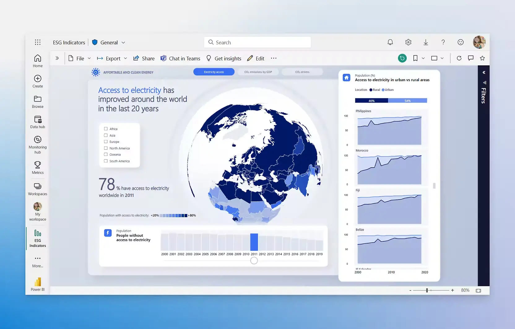
This consolidated view allows managers to quickly identify bottlenecks, reallocate resources, and communicate progress to stakeholders clearly. It turns multiple Planner plans into a single source of truth, making decision-making faster and data-driven.
Need a More Powerful, Automated Solution?
For small teams, a DIY dashboard works well. However, enterprise environments face challenges such as:
- Multiple plans across departments
- Complex task hierarchies and complex data models that require advanced data transformation and integration strategies.
- Real-time update requirements
- Governance and access control
Code Creators offers professional Planner-to-Power BI dashboards that are fully automated, scalable, and enterprise-grade. Our services ensure accurate, real-time reporting while freeing teams to focus on strategic project management.
| Feature/Scenario | DIY Implementation | Professional Implementation |
| Team Size/Plans | Ideal for small teams or a few plans | Perfect for large teams and multiple plans |
| Automation | Quick setup with manual control | Fully automated dashboards for effortless updates |
| Data Complexity | Great for simple tasks and basic fields | Handles nested data, custom fields, and complex setups easily |
| Refresh/Real-Time Updates | Manual refresh keeps you in control | Scheduled or near real-time updates for up-to-date insights |
| Scalability | Supports small projects efficiently | Enterprise-ready and scalable for growth |
| Maintenance | Minimal ongoing effort | Low maintenance with professional support |
| Stakeholder Reporting | Provides clear, accurate reports | Reliable, executive-ready dashboards that impress stakeholders |
Frequently Asked Questions
Can I connect multiple Planner plans to a single Power BI dashboard?
Yes, you can consolidate multiple Planner plans into one dashboard. This improves task management efficiency by giving a complete view of assignments, workloads, and deadlines across teams, making it easier to monitor overall progress.
How often does the data refresh from Planner to Power BI?
Power BI Desktop supports manual refresh, while Power BI Service allows scheduled refreshes multiple times per day. For near real-time tracking, you can set up automated reporting, ensuring your dashboards stay current and actionable.
Are there alternatives to using the OData feed?
Yes, Microsoft Graph API provides more flexibility through API integration. It allows access to custom fields, nested task details, and complex plan hierarchies. This method supports clean data integration and better Power BI visualization for advanced reporting needs.
What kind of reports and dashboards can I build with Planner data?
You can create task tracking dashboards, executive dashboards, and resource allocation reports. Applying dashboard design best practices and leveraging Power BI features like KPI cards, charts, and slicers helps teams track task completion rate, analyze task dependencies, and optimize resource allocation across teams.
Can Power BI display custom fields or task properties from Planner?
Yes, if custom fields are accessible via API integration or SharePoint, you can import and transform them in Power BI. This allows you to track task completion rate, monitor team productivity, and make more informed, data-driven decisions.
Conclusion
Connecting Microsoft Planner to Power BI transforms how teams track and manage tasks. By integrating these tools, you gain real-time visibility into task progress, team workload, and project status, which allows faster, data-driven decisions and reduces the time spent on manual reporting.
While building your own dashboards can provide valuable insights for smaller teams, larger organizations with multiple plans, complex task hierarchies, or high-frequency updates benefit from a professional, automated solution. Using Code Creators’ custom Power BI dashboards ensures your organization has enterprise-grade reporting, seamless automation, and dashboards tailored to your project management needs so your team can focus on strategy instead of managing data.
With the right integration, you can move from static task lists to intelligent, actionable dashboards that keep every stakeholder informed and help your projects stay on track. Partnering with Code Creators guarantees expert guidance, reliable implementation, and the confidence that your data drives better outcomes.