
Ever missed a project deadline because your timeline was scattered across spreadsheets and emails? A Gantt chart in Power BI helps you visualize all tasks in real time, making it easier to track progress and communicate with stakeholders. A clear schedule helps teams easily track task dependencies and critical tasks.
A gantt chart power bi setup solves this problem by turning raw project data into a clear timeline visualization. For project managers and business analysts, this makes it easier to see task progress, milestones, and possible bottlenecks.
In this guide, you will learn how to create Gantt chart in Power BI step by step through a practical power bi gantt chart tutorial. The process begins by organizing your task data efficiently and selecting the best gantt chart visualization power bi approach.
Why Gantt Charts Matter for Project Managers
A project plan may include dozens or hundreds of tasks, each with different task owners, deadlines, and task dependencies. Gantt charts provide clear timeline visualization, showing each task as a bar along a horizontal timeline, with its start date and end date, making visual scheduling of all project activities easy.
Better deadline tracking:
When tasks are visually placed on a timeline, it becomes much easier to identify delays or tasks that are approaching their deadlines.
Clear Stakeholder Communication:
Executives and stakeholders often appreciate a visual dashboard or executive dashboard, as it provides clear, engaging insights far more effectively than long reports. This makes complex timelines easier to understand.
Modern organizations increasingly use Power BI dashboards for project tracking. Unlike static spreadsheets, Power BI integrates multiple data sources, supports interactive filtering, and provides real-time data refresh for accurate project status updates.
This is a key reason organizations move beyond spreadsheets in Power BI vs Excel for project reporting and timeline management.
Understanding Gantt Charts in Power BI
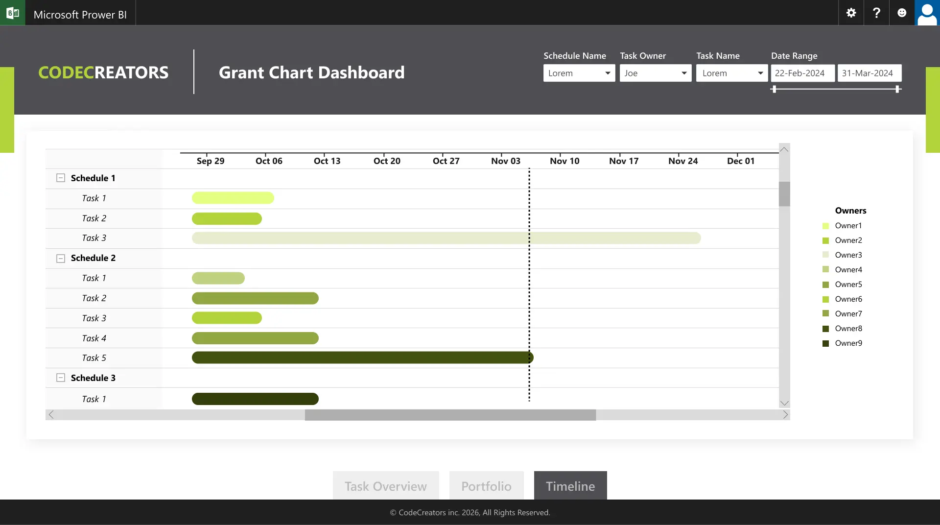
A Gantt chart is a horizontal bar chart used in Power BI visuals to display project timelines. Each task appears as a bar showing its start date, end date, and task duration.
Typical fields include:
- Task name
- Start date
- End date
- Task duration
- Task owner
- Project milestone indicators
- Task status
Adding task dependencies and critical tasks improves timeline visualization and helps teams prioritize work.
Users can filter tasks, drill down into project phases, compare timelines, and combine Gantt charts with KPIs to build a project analytics dashboard and Power BI project visualization.
In Power BI, Gantt charts are created using a built-in Gantt visual or marketplace Gantt visual, or through a custom power bi project visualization using DAX calculations.
Method 1: Using Power BI’s Built-In Gantt Visual
The easiest way to create a project timeline dashboard Power BI is by using a Gantt chart visual from the Power BI marketplace. These visuals automatically convert task data into horizontal bars on a timeline, making timeline management simple.
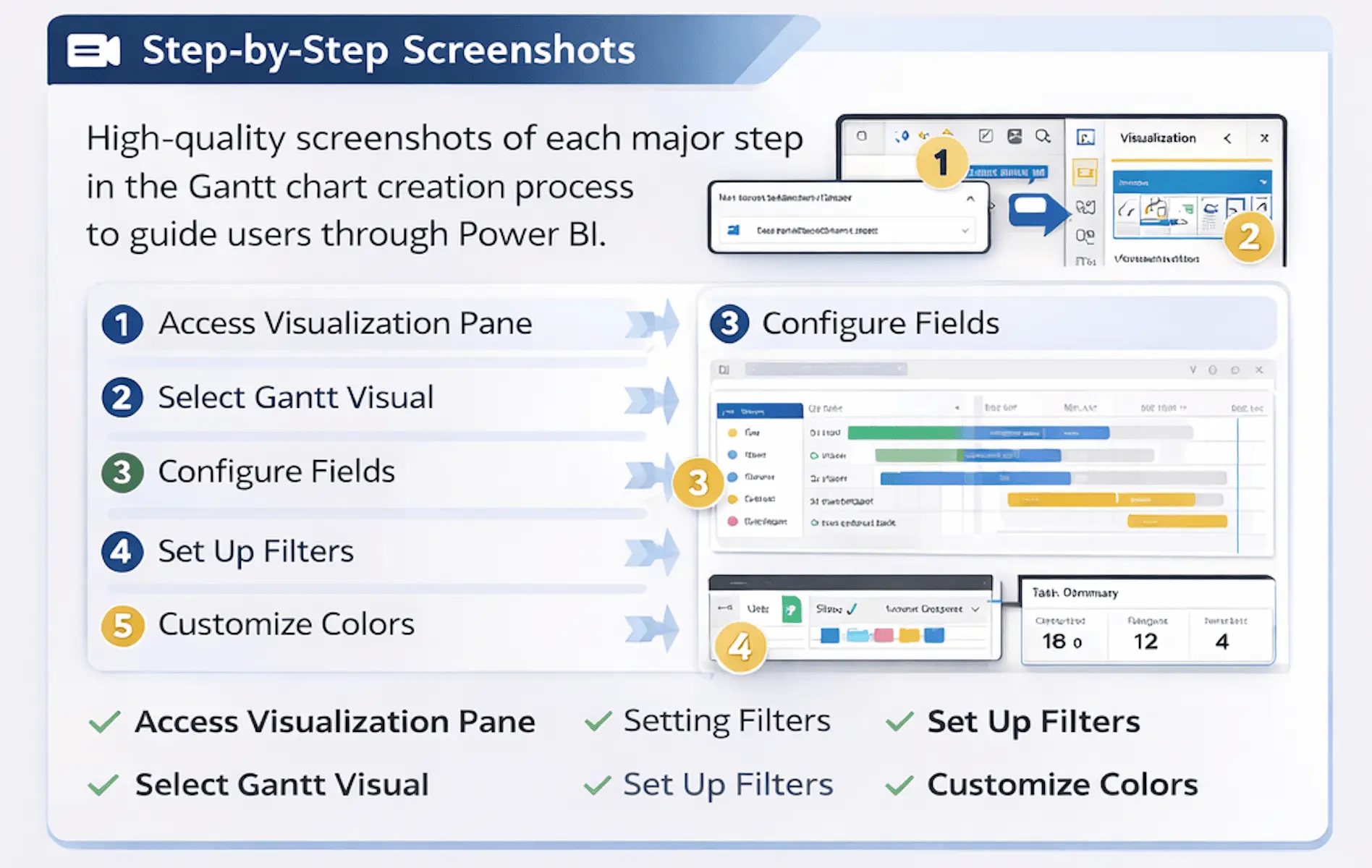
Step 1 – Prepare Your Data
The quality of your Gantt chart visualization depends on well-structured project data. When learning how to create Gantt chart in Power BI, start with a dataset containing Task Name, Start Date, and End Date.
Additional attributes:
- Task owner
- Task status
- Completion percentage
- Project phase
- Priority level
- Resource allocation
Many teams combine Excel data and project tools through Jira integration to create a unified view in Power BI. Use Power Query and data modelling to organize tasks, maintain metadata, and follow data governance for accurate Gantt chart tracking.
Power BI also supports connectors like Jira, SharePoint integration, and Microsoft Planner to centralize project data.
Step 2 – Create a New Visualization
Once your data is loaded into Power BI Desktop, creating a Gantt chart visualization Power BI is quick.
Open the Visualizations pane and add the Gantt chart visual from the Power BI marketplace if needed. Search for “Gantt Chart” and add it to the report canvas to display your project timeline.
After adding the visual, Power BI provides field placeholders to easily map your project data.
Step 3 – Configure Your Gantt Chart
After adding the visual, map your dataset fields to the Gantt chart so tasks appear correctly on the timeline.
- Task – Task Name
- Start Date
- End Date
- Legend – Task Status
- Resource – Task Owner
Once mapped, Power BI automatically generates a clear timeline chart. You can enhance the dashboard with filters and slicers to view tasks by department, project phase, or team member.
These features create an interactive project timeline dashboard Power BI for easy task tracking and analysis.
Step 4 – Customize Colors and Labels
Customization helps ensure your Gantt chart visualization communicates information clearly.
Best practices:
- Use status colors to highlight task progress
- Use clear task names so the Gantt chart remains easy to read.
- Group tasks by project phase or team to make the timeline easier to interpret.
- Use bookmarks and data refresh to keep your Power BI dashboard updated.
These simple improvements enhance the usability of your Gantt chart visualization Power BI dashboard.
Method 2: Building Custom Gantt Charts with DAX
While the built-in visual works well for many projects, larger organizations often require more advanced capabilities.
Enterprise environments frequently manage multiple projects simultaneously, track task dependencies, and monitor resource allocation across departments.
In these situations, creating a custom chart using gantt chart DAX power bi calculations and custom visuals provides greater flexibility.
Understanding DAX for Gantt Charts
DAX (Data Analysis Expressions) is the formula language used within Power BI for creating calculated columns, measures, and data modeling logic.
In a Gantt chart scenario, gantt chart dax power bi helps calculate elements such as:
- Task duration
- Timeline offsets
- Task completion indicators
- Conditional formatting rules
These calculations allow developers to control exactly how tasks appear within the timeline.
Creating Start and End Date Calculations
One of the most common calculations when building custom Gantt charts is task duration.
For example:
Task Duration =

DATEDIFF(Project[StartDate], Project[EndDate], DAY)
This formula calculates how many days each task spans.
You can also create logic that highlights potential schedule issues.
For example:
Task Status =

IF(Project[EndDate] < TODAY(), "Delayed", "On Track")
Building the Visual Layer
Once the necessary calculations are created, the visual layer can be built using standard Power BI charts such as stacked bar charts or matrix visuals, offering a complete timeline view of tasks and milestones.
Advanced dashboards may include:
- Horizontal bars representing task duration
- Color indicators for task status
- Milestone markers for important events
- Conditional formatting for overdue tasks
Organizations often combine these visuals with supporting metrics such as project management KPIs. This combination transforms a timeline visualization into a comprehensive project performance dashboard.
Adding Interactivity with Filters
One of the biggest advantages of Power BI dashboards is interactivity.
Filters allow users to quickly explore project data from different perspectives, enhancing visual interactivity and making it easier to focus on specific tasks or critical paths.
Common filters include:
- Project name
- Task owner
- Status category
- Timeline range
Now that you’ve explored both the built-in and custom DAX approaches, here’s how they compare across key dimensions to help you choose the right solution for your organization.
| Feature/Aspect | Built-In Gantt (Quick & Easy) | Professional Custom Dashboard (Advanced & Impactful) |
| Setup | Fast and simple | Seamless multi-project tracking |
| Data Sources | Excel or Planner | Jira, Planner, SharePoint |
| Customization | Colors, labels, grouping | Tailored visuals, KPIs, milestones |
| Interactivity | Filters and slicers | Drill-downs, bookmarks, real-time updates |
| Scalability | Small projects or teams | Enterprise-level, multiple teams |
| Maintenance | Low effort, easy | Automated, governance-friendly |
| Best Use | Quick insights | Complete project visibility, executive-ready |
Real-World Example: Project Timeline Dashboard
Imagine a product development team enthusiastically driving toward a major software release. Their project timeline highlights many valuable tasks, from design and development to testing and deployment.
A well-designed project timeline dashboard Power BI can showcase:
- A central Gantt chart in Power BI that clearly presents the entire project timeline
- KPI cards highlighting sprint progress and completion rates
- Filters for development teams and task owners, making Power BI project tracking simple
- Milestone indicators that spotlight important release phases and achievements
When developers update tasks in tools like Jira or Microsoft Planner tracking, the real-time data automatically flows into Power BI, keeping dashboards current without manual intervention.
Common Gantt Chart Mistakes in Power BI (And How to Avoid Them)
Even experienced teams sometimes encounter challenges when building timeline dashboards.
Here are a few common issues and how to solve them.
Data Structure
Consistent start and end dates make your Gantt chart clear and reliable.
Solution:
Standardize your data and ensure each task has valid timeline information for smooth tracking.
Overcrowded Visualizations
Focusing on key tasks helps your Gantt chart stay clear and easy to read.
Solution:
Use filters or drill-downs to highlight specific project phases.
Performance with Large Datasets
Optimizing your data ensures dashboards remain fast and responsive, even with large projects.
Solution:
Optimize your data model, focus on essential columns, and leverage efficient data modeling practices for the best results.
Frequently Asked Questions
Can I create a Gantt chart in Power BI without DAX?
Yes. A built-in Gantt visual from the Power BI marketplace converts task data into a project timeline dashboard without DAX formulas.
How do I handle task dependencies in a Power BI Gantt chart?
Use fields or milestone markers. Custom visuals and DAX calculations can highlight critical tasks in your timeline visualization.
What data format does Power BI need for Gantt charts?
At minimum, include task name, start date, and end date. Optional fields like status, owner, and completion percentage enhance Power BI project tracking and dashboard analytics.
Can I update my Gantt chart in real-time from Jira or Microsoft Planner?
Yes. Power BI supports integrations with tools like Jira and Microsoft Planner, so your Gantt chart updates in real time as tasks are modified.
Is Power BI better than Excel for Gantt charts?
For small projects, Excel works, but Power BI offers dynamic filtering, interactive dashboards, and automated project tracking, making it ideal for enterprise-scale project timeline visualization.
Getting Started with Your Gantt Chart
Even a basic Gantt chart in Power BI delivers immediate value. Start with a simple dataset and add KPIs, filters, and automation to track tasks, milestones, and project phases effectively. Share dashboards via Power BI Service for team-wide project visibility.
For enterprise-grade Gantt chart dashboards, Code Creators’ custom Power BI solutions offer tailored visualizations combining project timelines, interactive dashboards, and automated reporting. If you want to explore a solution that fits your team’s workflow, consider connecting with our experts to see how your dashboards can evolve. This power bi Gantt chart tutorial covers both simple and advanced approaches, helping you build dashboards that scale with your project needs.
Conclusion
Gantt charts are one of the most effective ways to visualize project timelines and track task progress. When combined with Power BI’s interactive analytics capabilities, they provide a clear view of task dependencies, milestones, and overall project performance.
By following the steps in this guide, teams can build practical dashboards that improve timeline visibility and help stakeholders understand project progress more easily.
As projects grow more complex, organizations often require deeper analytics, automated reporting, and integrations with multiple project management tools. In such cases, exploring custom Power BI dashboard solutions from Code Creators can help transform project data into a more structured and actionable reporting system.