Accessibility & Inclusive Design in SharePoint Intranets
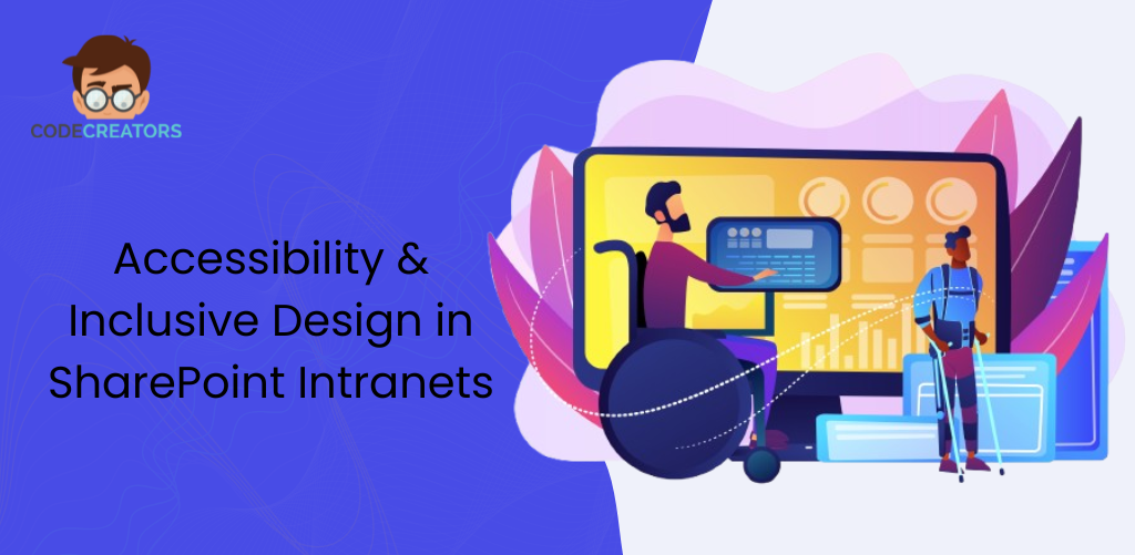
Creating an inclusive digital workplace starts with SharePoint intranet design. It is about more than just making a site look “modern.” Truly great design ensures that every single person, regardless of their physical or cognitive abilities, can find the information they need to do their job. When we build for everyone, we create a culture of belonging and high performance. In this article we will discuss Inclusive Design for businesses, Best SharePoint Intranet Designs and How we can Make SharePoint Intranet Accessible for All Employees.
Why Inclusive Design Matters for Business
Inclusive design is not just a checkbox for your legal department. It is a smart business strategy. When you prioritize accessibility, you unlock the potential of your entire workforce.
- Productivity for All: An accessible site is easier to use for everyone, not just people with disabilities. Simple navigation helps the tired employee at 4:00 PM just as much as it helps someone with a cognitive challenge.
- Legal Compliance: Many regions now have strict laws (like the ADA in the US or EN 301 549 in Europe) requiring digital tools to meet WCAG (Web Content Accessibility Guidelines) standards.
- Retention and Morale: Employees stay where they feel valued. Providing an intranet that “just works” for everyone shows that you care about their daily experience.
Modern SharePoint intranet design gives you the tools to meet these goals without needing to be a master coder. Microsoft has built many accessibility features directly into the platform; you just need to know how to use them.
Intranet SharePoint Design:
To make your site accessible, you should follow the “POUR” framework. This is the gold standard for intranet sharepoint design and ensures your content is useful for everyone.
1. Perceivable (Can they see or hear it?)
Users must be able to perceive the information you present. You cannot rely on color alone to convey meaning. For example, if you mark overdue tasks in red and on-time tasks in green, a color-blind user will struggle. Use icons (like a checkmark or an X) alongside the color.
2. Operable (Can they navigate it?)
The site must work without a mouse. Many users navigate using only a keyboard or voice commands. If your menus require a “hover” action to open, they might be impossible for some people to use. Ensure your “Quick Links” and “Mega Menus” are easy to tab through.
3. Understandable (Is it easy to follow?)
Keep your language simple. Avoid using internal jargon that new hires won’t know. Use clear headings so that someone scanning the page (or using a screen reader) can jump to the section they need.
4. Robust (Does it work on all devices?)
Your intranet should work perfectly on a laptop, a tablet, or a smartphone. It should also work with “Assistive Technology” like screen readers (JAWS or NVDA) and high-contrast browser modes.
Designing SharePoint Intranet with Visual Clarity
When you are designing SharePoint intranet pages, color and contrast are your most important tools. If your brand colors are light blue and white, you might find that text is very hard to read against certain backgrounds.
Color Contrast Ratios
To meet standard accessibility rules, your text should have a contrast ratio of at least 4.5:1 against its background.
- Do: Use dark text on a light background or white text on a very dark background.
- Avoid: Placing text over busy images or using light gray text on a white background.
Typography and Spacing
Use standard, clean fonts. SharePoint defaults to “Segoe UI,” which is highly readable. Avoid using too many different font sizes. Instead, stick to the built-in “Heading 1,” “Heading 2,” and “Heading 3” styles. This creates a logical “map” for screen readers to follow.
Best SharePoint Intranet Designs:
The best SharePoint intranet designs don’t just look good, they communicate clearly. How you add content is just as important as the layout itself.
The Power of Alt-Text
Whenever you upload an image to a SharePoint News post or a Hero web part, you will see a box for “Alternative Text” (Alt-Text). Never leave this blank. A screen reader will read this description to a user who cannot see the image.
- Bad Alt-Text: “Image123.jpg”
- Good Alt-Text: “A group of employees celebrating a project launch in the main lobby.”
Video Transcripts and Captions
If you share a video from the CEO on your home page, ensure it has captions. This helps people who are deaf or hard of hearing, but it also helps employees working in a loud office or a quiet library who don’t have headphones.
SharePoint Intranet Design Best Practices for Layout
To keep your site organized and accessible, follow these SharePoint intranet design best practices:
| Hero Web Part | Use clear, descriptive titles on every tile. | Helps keyboard users know where the link goes. |
| Quick Links | Use the “Button” or “Grid” layout with icons. | Makes it easier for people with motor impairments to click. |
| News Web Part | Limit the number of items to 5 or 6. | Prevents “information overload” for neurodivergent users. |
| Search | Ensure the search bar is always in the same place. | Consistency helps users with cognitive challenges find their way. |
How to Make SharePoint Intranet Accessible for All Employees
If you want to know how to make SharePoint intranet accessible for all employees, the answer lies in testing. You cannot guess if a site is accessible; you have to verify it.
Use the Built-in Accessibility Checker
Microsoft has integrated an accessibility checker into most of its tools. While you are editing a page, look for the “Accessibility” button. It will scan your page and flag issues like missing alt-text or low color contrast. It even gives you a “Fix” button to solve the problem instantly.
Test with a Keyboard
Put your mouse away for ten minutes. Try to navigate your home page using only the Tab and Enter keys. If you get “stuck” in a menu or cannot find where the cursor is, your design needs adjustment.
Ask for Feedback
Create a “Feedback” link at the bottom of your site. Encourage employees to report if they find a section hard to use. True inclusive design is a conversation, not a one-time project.
Conclusion:
Mastering SharePoint intranet design is about more than pixels and code. It is about empathy. When we take the time to add alt-text, check our color contrast, and simplify our navigation, we are telling our coworkers: “You belong here, and your work matters.”
By following SharePoint intranet design best practices, you transform a simple tool into a powerful engine for collaboration. You ensure that whether an employee is using a screen reader, a smartphone, or a high-end desktop, they have the same opportunity to succeed.
If you are ready to build a strategic, accessible, and future-ready digital workplace, Code Creators is here to help. We specialize in creating the best SharePoint intranet designs that meet the highest standards of inclusion and performance.
Contact us today, and we will help you make your SharePoint journey smooth and truly inclusive for all.
FAQS
Q: How do I check if my site is accessible?
SharePoint includes a built-in Accessibility Checker. While you are editing a page, run this tool to find issues like missing image descriptions or low-contrast text. It provides instant suggestions to help you fix these errors.
Q: Why is Alt-Text important in SharePoint?
Alt-Text is a short written description of an image. Screen readers read this description aloud for users who cannot see the picture. This ensures that every employee receives the same information, even if they have visual impairment.
Q: Does inclusive design make an intranet look plain?
No. Best SharePoint intranet designs are often the most accessible because they are clean and organized. High-contrast colors and simple layouts actually make your site look more professional and easier for everyone to navigate.